%matplotlib inline
import matplotlib.pyplot as plt
import numpy as np7 Visualization
Data visualization is an essential aspect of scientific and engineering analysis and interpretation. It involves the graphical representation of data, allowing for an intuitive and efficient understanding of complex datasets. Here’s why visualization is so crucial:
Visualization simplifies the complexity inherent in data. By converting raw data into visual formats such as charts, graphs, and maps, it becomes easier to identify patterns, trends, and outliers. This enhanced understanding aids in making informed decisions based on the data.
Graphs and charts are universally understood, transcending language barriers and simplifying the communication of insights. Visualization allows data analysts, scientists, and business professionals to convey their findings to a broader audience, including those without technical expertise.
Visual representations can reveal trends and patterns that might not be apparent in raw data. For example, time series graphs can show trends over time, while scatter plots can reveal relationships between variables. This capability is invaluable in fields such as finance, healthcare, and marketing, where timely insights are crucial.
Studies have shown that humans are more likely to remember information presented visually compared to text. Visual aids improve the retention and recall of information, making data visualization an effective tool for teaching and presentations.
Before diving into complex statistical analyses, visualizing data can provide a preliminary understanding of the dataset. Techniques like scatter plots, histograms, and box plots help in identifying the distribution of data, spotting anomalies, and determining the next steps in the analysis.
Modern visualization tools offer interactivity, allowing users to explore data dynamically. Interactive charts and dashboards enable users to drill down into specific data points, filter datasets, and customize views, providing a more flexible and engaging way to analyze data.
7.1 Libraries for Visualization using Python
Some of the visualization tools available in Python include:
- Matplotlib: The foundational library for creating static plots in Python. It provides extensive control over plot appearance and is highly customizable.
- Seaborn: Built on top of Matplotlib, Seaborn simplifies the creation of attractive and informative statistical graphics. It integrates well with pandas data structures and enhances Matplotlib’s capabilities.
- Plotly: Known for creating interactive plots, Plotly is used for producing high-quality graphs that can be embedded in web applications. Will not be discussed in the course and can be studied from resources.
- Bokeh: Another library for creating interactive plots, Bokeh is particularly useful for large datasets and creating dashboards.
7.1.1 Matplotlib
Matplotlib is a popular Python library used for creating high-quality, publication-ready visualizations such as graphs, charts, and plots. It was developed in the early 2000s by John D. Hunter.
As usual, we start by importing the necessary libraries. Then using the plot function, we can plot the data.
The most common type of data that is visualized are functions. A function \(f(x) = \sin (x)\) takes in \(x\) and outputs \(f\). To plot functions, we provide a range of input values that the function takes and outputs a range of values. A simple matlabesque plot can be generated using the following command.
x = np.linspace(0, 2*np.pi, 2000)
plt.figure(figsize=(4, 4))
plt.plot(x, np.sin(x))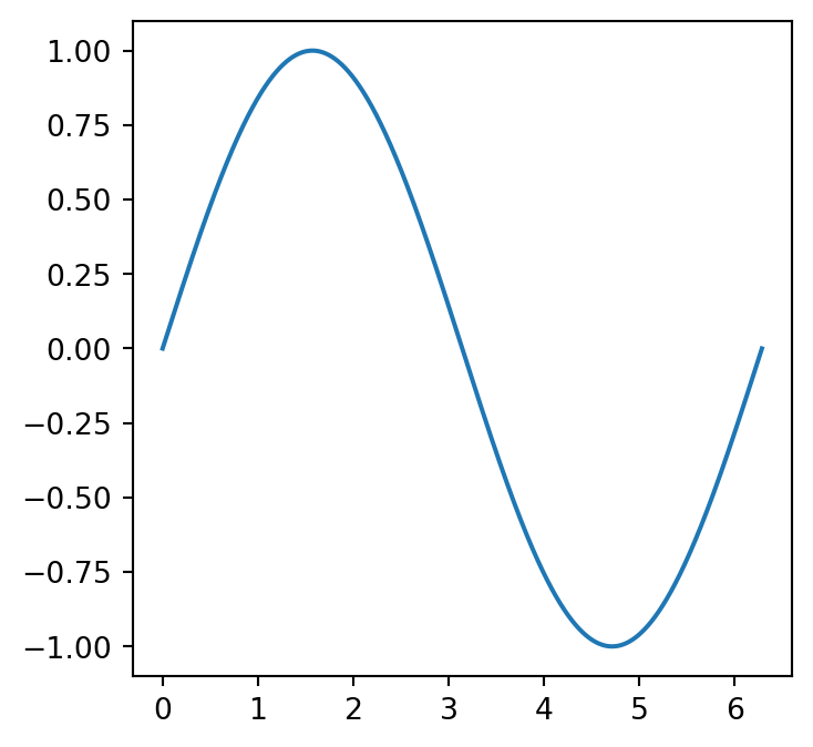
While this might be a quick way to generate figures, the object-oriented framework of matplotlib is more powerful and flexible.
7.1.2 Bokeh
Bokeh is another popular library for creating interactive visualizations in Python. It is designed for creating web-based plots and dashboards that can be viewed in a web browser. Bokeh provides a high-level interface for creating interactive plots with a wide range of features and customization options. It is basically powered by JavaScript.
import numpy as np
import pandas as pd

from bokeh.palettes import tol
from bokeh.plotting import figure, show
from bokeh.io import output_notebook

N = 10
df = pd.DataFrame(np.random.randint(10, 100, size=(15, N))).add_prefix('y')

output_notebook()
p = figure(x_range=(0, len(df)-1), y_range=(0, 800))
p.grid.minor_grid_line_color = '#eeeeee'

names = [f"y{i}" for i in range(N)]
p.varea_stack(stackers=names, x='index', color=tol['Sunset'][N], legend_label=names, source=df)

p.legend.orientation = "horizontal"
p.legend.background_fill_color = "#fafafa"

show(p)7.2 The Object-Oriented Framework of Matplotlib
Since its release, Matplotlib has become the de facto standard for data visualization in Python, and it is widely used in various scientific and engineering fields, as well as in industry and academia. One of the key features of Matplotlib is its flexibility, which allows users to create a wide range of visualizations with a high degree of customization.
Matplotlib is built on top of the NumPy and SciPy libraries, which provide the numerical and scientific computing capabilities necessary for data analysis and visualization. It also integrates well with other popular data analysis libraries in the Python ecosystem, such as pandas and seaborn.
Over the years, Matplotlib has undergone significant improvements and enhancements, with the latest release offering new features such as 3D plotting, interactive plotting, and improved performance. With its ease of use, extensive documentation, and broad community support, Matplotlib remains a powerful tool for data visualization in Python.
Matplotlib is a powerful plotting library in Python that allows for the creation of static, animated, and interactive visualizations. While Matplotlib provides a scripting interface (often via pyplot), understanding its object-oriented (OO) approach offers greater control and customization over plots. This introduction will help you understand the fundamentals of the OO framework in Matplotlib with examples.
The Basics of the Object-Oriented Approach
In the OO approach, plots are treated as objects. The primary objects in Matplotlib are Figure and Axes. Here’s a brief overview:
- Figure: This is the entire window or page on which everything is drawn. It can contain multiple Axes.
- Axes: These are the actual plots within the Figure. A Figure can contain multiple Axes objects.
7.2.1 A Basic Plot
Let’s start with a simple example to illustrate the OO framework:
import matplotlib.pyplot as plt

# Create a Figure object
fig = plt.figure(figsize=(7, 7))

# Add an Axes object to the Figure
ax = fig.add_axes([0.1, 0.1, 0.8, 0.8])  # [left, bottom, width, height]

# Plotting data
ax.plot([1, 2, 3, 4], [10, 20, 25, 30])

# Setting labels and title
ax.set_xlabel('X-axis')
ax.set_ylabel('Y-axis')
ax.set_title('Simple Plot')

# Display the plot
plt.show()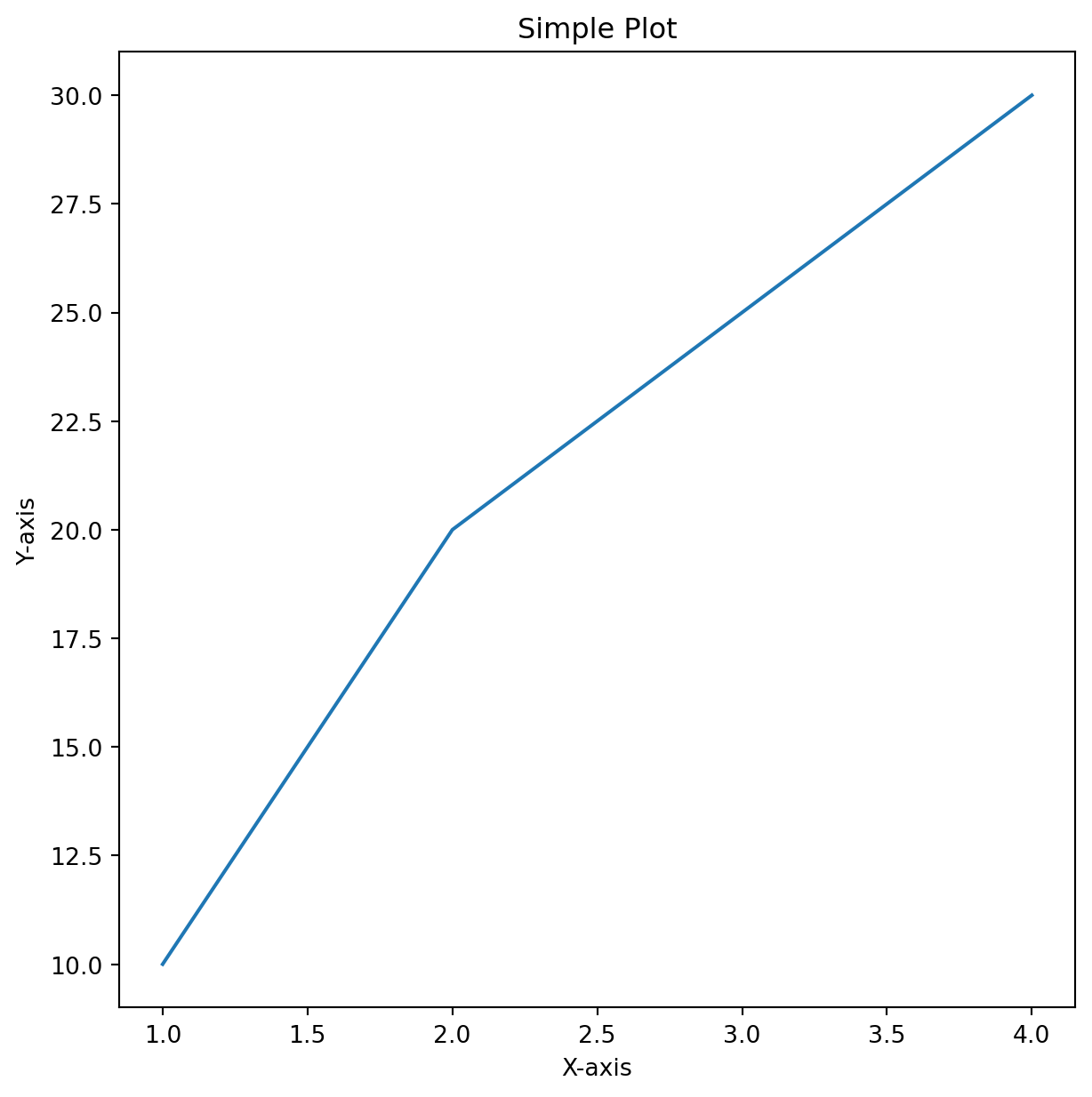
the code fig = plt.figure() creates a Figure object. ax = fig.add_axes([0.1, 0.1, 0.8, 0.8]) adds an Axes object to the Figure. The list specifies the dimensions of the Axes (left, bottom, width, height) in relative units. ax.plot() is used to plot data. ax.set_xlabel(), ax.set_ylabel(), and ax.set_title() set the labels and title for the Axes.
7.2.2 Adding Multiple Axes
You can add multiple Axes to a single Figure to create more detailed visualizations.
import matplotlib.pyplot as plt

# Create a Figure object
fig = plt.figure(figsize=(7, 7))

# Add first Axes
ax1 = fig.add_axes([0.1, 0.1, 0.8, 0.8])
ax1.plot([1, 2, 3, 4], [10, 20, 25, 30])
ax1.set_title('Main Plot')

ax1.set_xlabel('X-axis')
ax1.set_ylabel('Y-axis')

# Add second Axes
ax2 = fig.add_axes([0.2, 0.6, 0.25, 0.25])
ax2.plot([1, 2, 3, 4], [10, 20, 25, 30])
ax2.set_title('Inset Plot')
ax2.set_xlabel('X-axis')
ax2.set_ylabel('Y-axis')

# Display the plot
plt.show()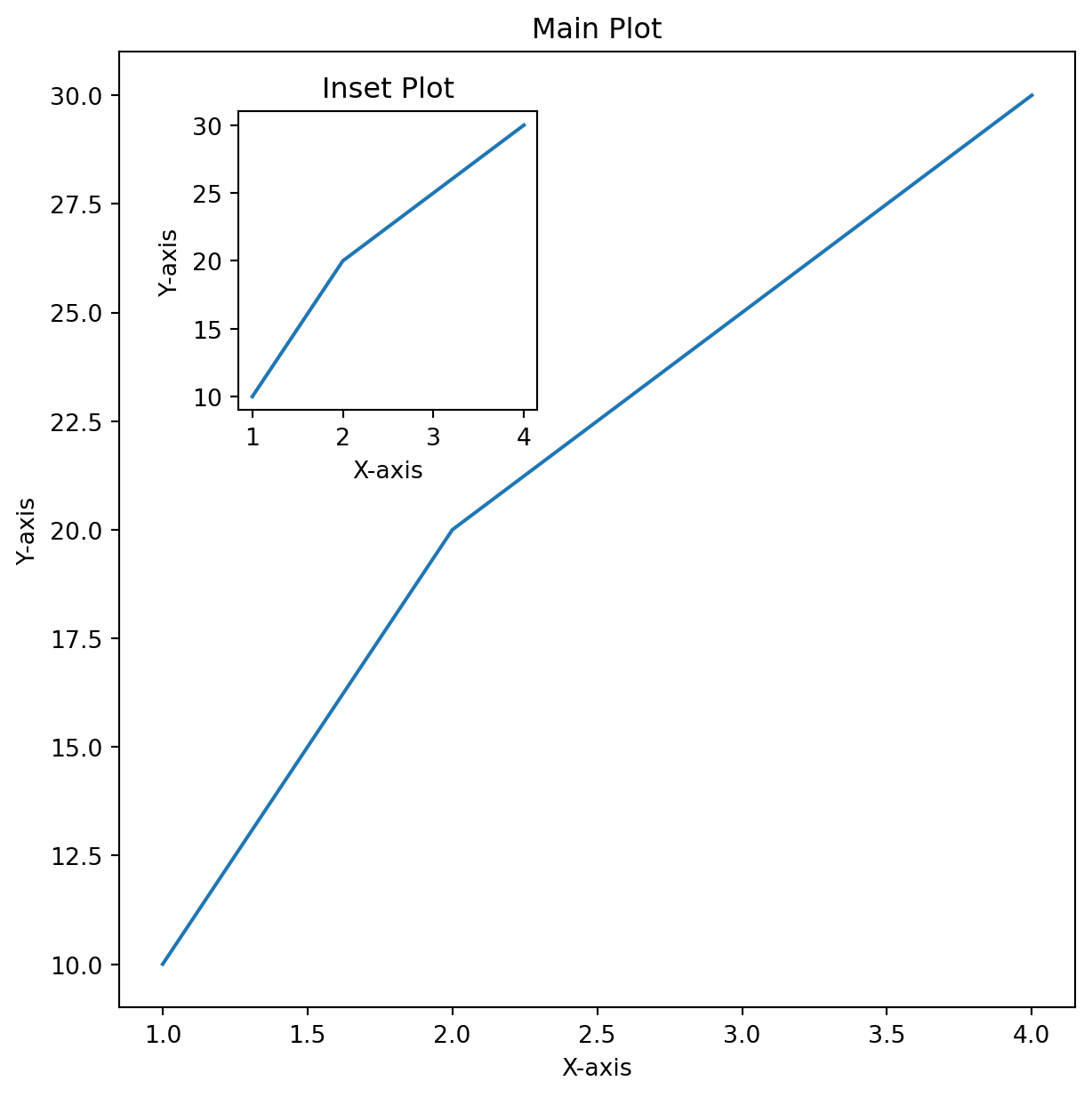
In this example, ax2 is an inset plot within the main plot ax1.
7.2.3 Using subplots for Multiple Plots
A more convenient way to create multiple plots is by using the subplots method. Here instead of adding Axes manually, you can create a grid of Axes within a single Figure.
import matplotlib.pyplot as plt
import numpy as np

# Sample data for each plot
data = [
    ([1, 2, 3, 4], [10, 20, 25, 30], 'Plot 1'),
    ([1, 2, 3, 4], [30, 25, 20, 10], 'Plot 2'),
    ([1, 2, 3, 4], [10, 20, 10, 20], 'Plot 3'),
    ([1, 2, 3, 4], [30, 20, 10, 30], 'Plot 4')
]

# Create a Figure with a 2x2 grid of Axes
fig, axes = plt.subplots(2, 2, figsize=(7, 7))

# Flatten the axes array for easy iteration
axes_flat = axes.flatten()

# Plot data on each Axes using a loop
for ax, (x, y, title) in zip(axes_flat, data):
    ax.plot(x, y)
    ax.set_title(title)
    ax.set_xlabel('X-axis')
    ax.set_ylabel('Y-axis')

# Adjust layout to prevent overlap
plt.tight_layout()

# Display the plot
plt.show()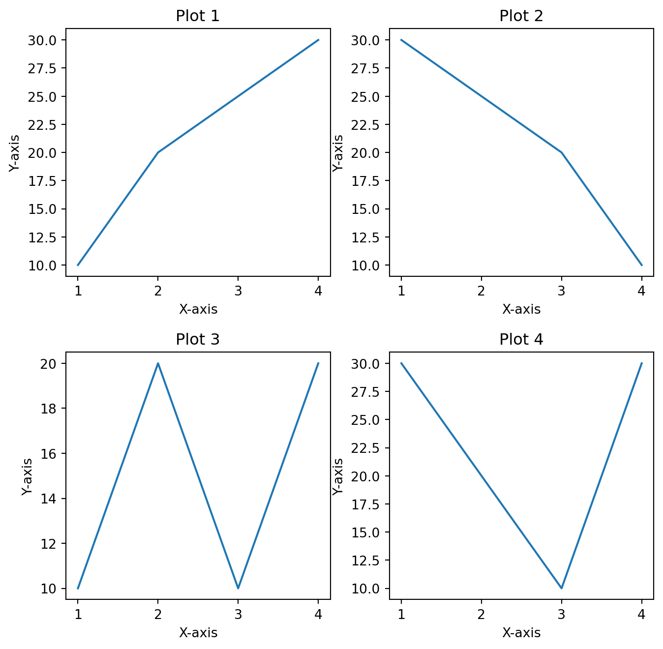
Here, fig, axes = plt.subplots(2, 2) creates a Figure and a 2x2 grid of Axes. You can access each Axes using axes[row, col].
7.2.4 Customizing Plots
The OO approach provides extensive methods to customize plots:
import matplotlib.pyplot as plt

# Create a Figure and Axes
fig, ax = plt.subplots(figsize=(7, 7))

# Plot data
ax.plot([1, 2, 3, 4], [10, 20, 25, 30], label='Data $a$', linestyle='-.')
ax.plot([1, 2, 3, 4], [10, 10, 20, 25], label='Data $b$', linestyle='--')
ax.plot([1, 2, 3, 4], [20, 10, 30, 20], label='Data $c$', linestyle=':')

# Customize plot
ax.set_xlabel('X-axis')
ax.set_ylabel('Y-axis')
ax.set_title('Plot Title')
ax.legend()
ax.grid(True)

# Customize ticks
ax.set_xticks([1, 2, 3, 4])
ax.set_yticks([10, 20, 30])

# Customize tick labels
ax.set_xticklabels(['One', 'Two', 'Three', 'Four'])
ax.set_yticklabels(['Ten', 'Twenty', 'Thirty'])

# Display the plot
plt.show()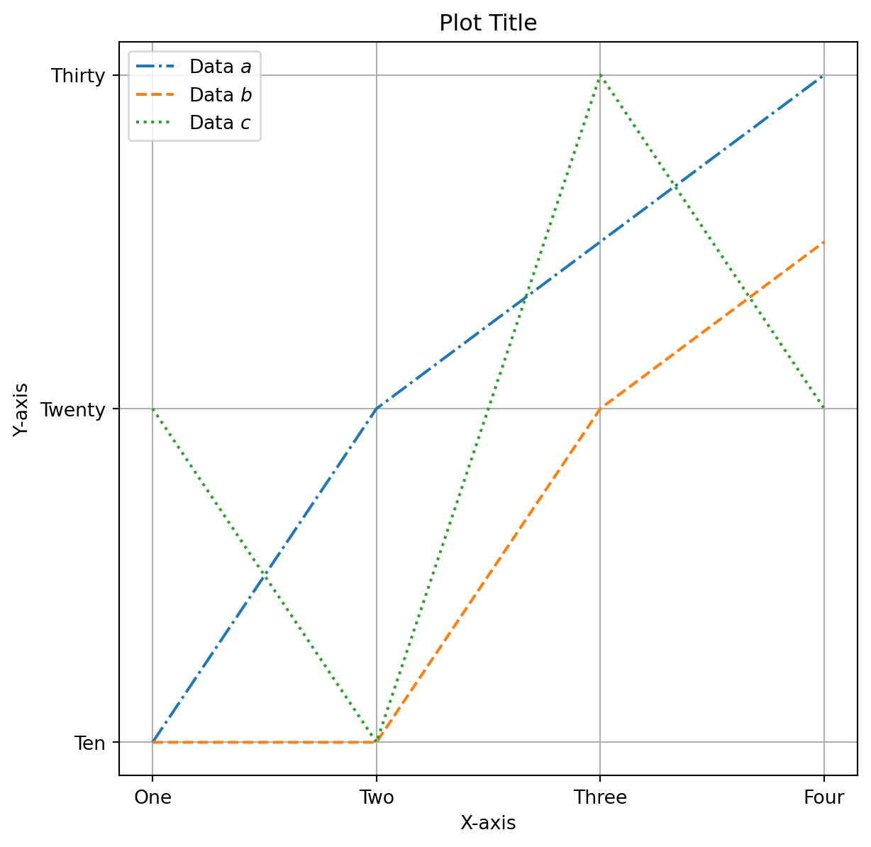
In this example, we customize labels, add a legend, enable grid lines, and set specific tick locations and labels.
By treating plots as objects, you gain more control over their appearance and behavior. Understanding this framework is essential for creating advanced visualizations that are both informative and visually appealing.
import matplotlib.pyplot as plt
import numpy as np

x = np.linspace(0, 4*np.pi, 100)

# Create a Figure and Axes
fig, ax = plt.subplots(figsize=(7, 7))

# Plot data

# specify color by name
ax.plot(x, np.sin(x), color='blue',linestyle='-.')

# short color code (rgbcmyk)
ax.plot(x, x*np.sin(x - 1), color='g',   linestyle='--')

# Grayscale between 0 and 1
ax.plot(x, x*np.sin(x - 2), color='0.75',linestyle=':')

# Hex code (RRGGBB from 00 to FF)
ax.plot(x, x*np.sin(x - 3), color='#FFDD44',linestyle='-')

# RGB tuple, values 0 to 1
ax.plot(x, x*np.sin(x - 4), color=(1.0, 0.2, 0.3))

# all HTML color names supported
ax.plot(x, x*np.sin(x - 5), color='chartreuse')

# Customize plot
ax.set_xlabel('X-axis')
ax.set_ylabel('Y-axis')
ax.set_title('$\sin$ curves')
ax.legend(['$sin(x)$', '$x sin(x-1)$', '$xsin(x-2)$', '$xsin(x-3)$', '$xsin(x-4)$', '$xsin(x-5)$'])
ax.grid(True)

# Customize ticks
ax.set_xticks([0, np.pi, 2*np.pi, 3*np.pi, 4*np.pi])

# Customize tick labels
ax.set_xticklabels(['0', '$\pi$', '$2\pi$', '$3\pi$', '$4\pi$'])

# Display the plot
plt.show()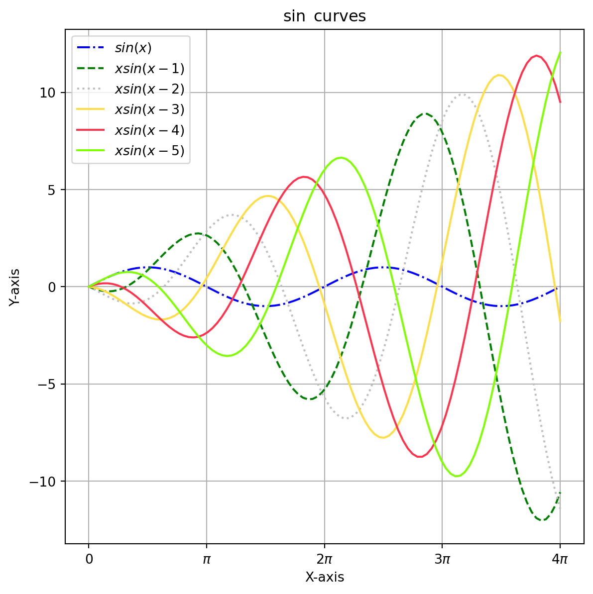
List of all markers can be found here: https://matplotlib.org/stable/api/markers_api.html
7.2.5 Scatter Plots
A common scientific example of a dataset that can be plotted using a scatter plot in Python is a dataset of experimental measurements with two variables. For instance, consider an experiment where the aim is to investigate the relationship between two physical quantities, such as temperature and pressure.
In such an experiment, data is typically collected by measuring both temperature and pressure under various experimental conditions. Each data point in the dataset corresponds to a pair of temperature and pressure measurements obtained at a specific experimental condition.
To visualize this dataset, a scatter plot can be used to plot each data point as a point in a two-dimensional coordinate system, where one axis corresponds to temperature and the other axis corresponds to pressure. Each point in the scatter plot represents a specific experimental condition, and the location of the point corresponds to the temperature and pressure measurements obtained at that condition.
The scatter plot can then be used to visualize the relationship between the two variables. For instance, it may reveal whether there is a linear relationship between temperature and pressure, or whether the relationship is more complex. By visualizing the data in this way, it is easier to gain insights and draw conclusions about the experiment.
import matplotlib.pyplot as plt
import numpy as np

# Generate some sample data
temperature = np.array([25, 30, 35, 40, 45])
pressure = np.array([100, 120, 130, 150, 170])

# Create a Figure and Axes
fig, ax = plt.subplots(figsize=(7, 7))

# Create a scatter plot
ax.plot(temperature, pressure, 'o')  # 'o' indicates circular markers

# Add labels and title
ax.set_xlabel('Temperature (Celsius)')
ax.set_ylabel('Pressure (kPa)')
ax.set_title('Temperature vs. Pressure')

# Show the plot
plt.show()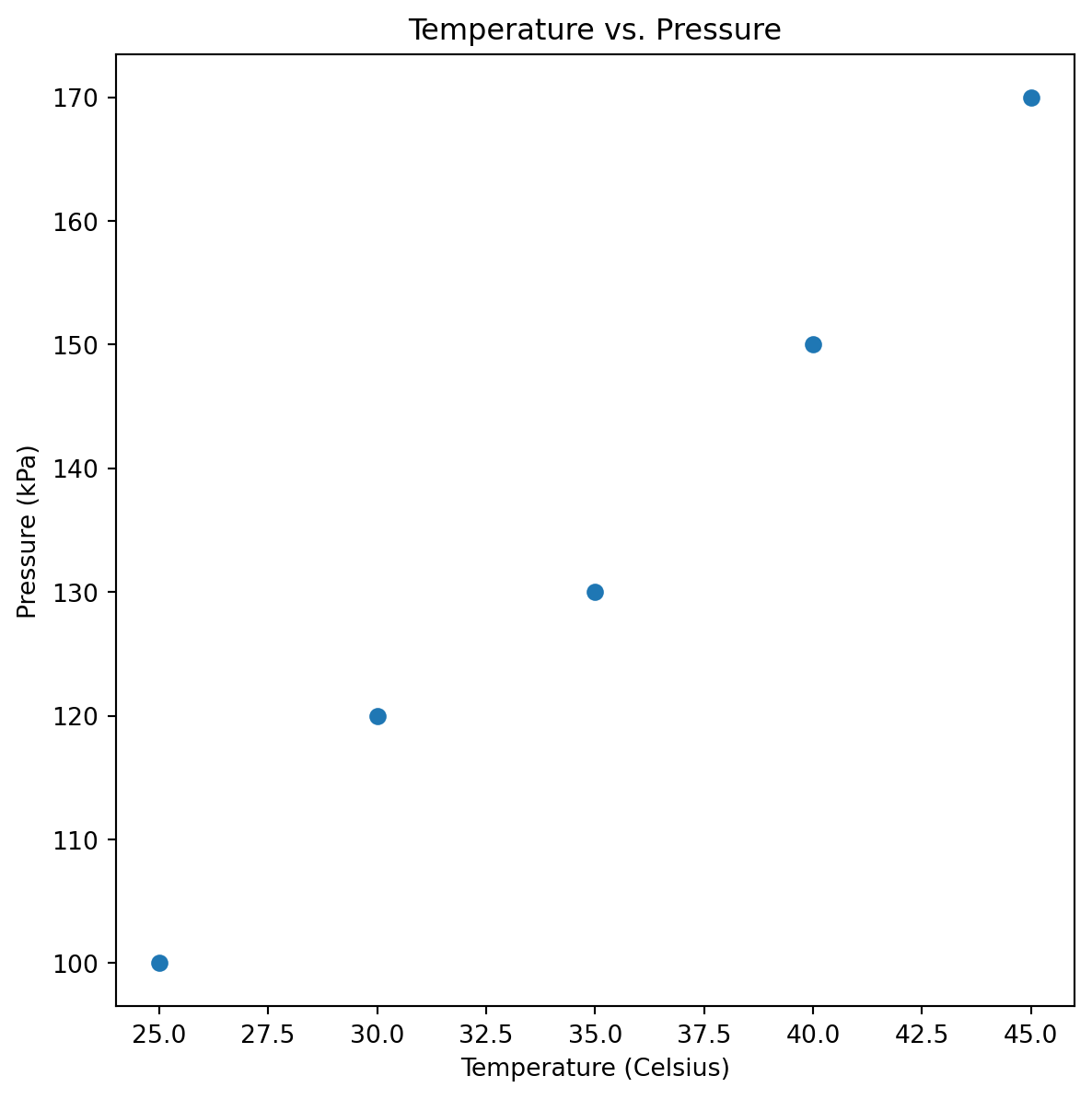
Often we also deal with uncorrelated data !
rng = np.random.RandomState(seed=0) # A random number generator initialized with a certain stateimport matplotlib.pyplot as plt
import numpy as np
# Generate some sample data
np.random.seed(0) # For reproducibility
x = np.random.rand(50) * 100 # Random data for x
y = np.random.rand(50) * 100 # Random data for y (not correlated with x)
z = np.random.rand(50) * 1000 # Data for scaling marker sizes
# Create a Figure and Axes
fig, ax = plt.subplots(figsize=(7, 6))
# Create a scatter plot
scatter = ax.scatter(x, y, s=z, c=z, alpha=0.5, cmap='Spectral')
# s=z scales the marker sizes, c=z maps the color to the data, alpha sets transparency
# Add labels and title
ax.set_xlabel('X-axis (Random Data)')
ax.set_ylabel('Y-axis (Random Data)')
ax.set_title(' A colorful scatter plot')
# Add color bar
cbar = plt.colorbar(scatter, ax=ax)
cbar.set_label('Values of Z')
# Show the plot
plt.show()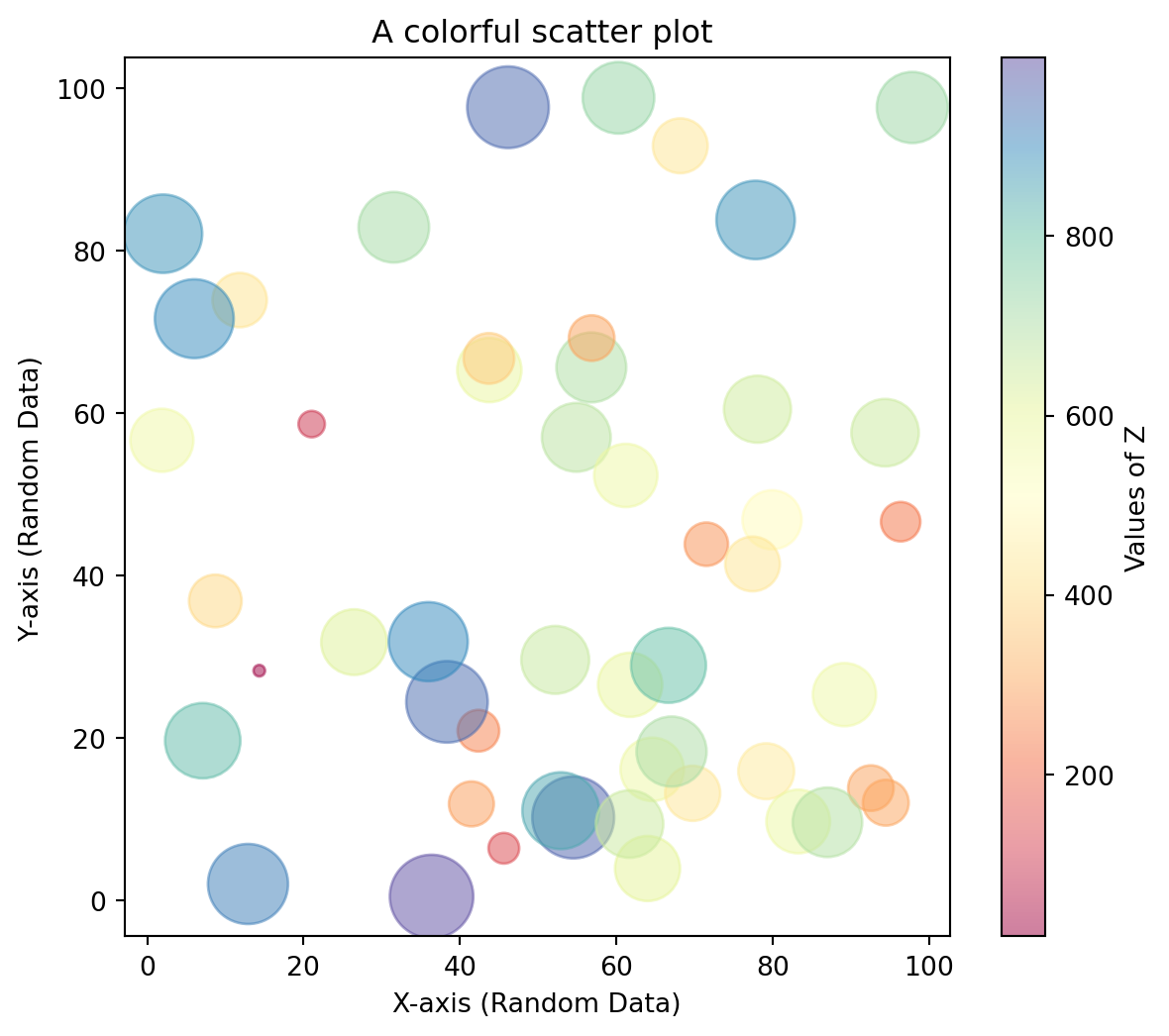
Notice that the color argument is automatically mapped to a color scale (shown here by the colorbar() command), and that the size argument is given in pixels. In this way, the color and size of points can be used to convey information in the visualization, in order to visualize multidimensional data.
List of colormaps can be found here: https://matplotlib.org/stable/tutorials/colors/colormaps.html
7.2.6 Multiple Subplots and Saving Plots
Multiple plots can be generated by using the axes description ! Saving is automatically inferred !
x_m = np.linspace(0, 10, 100)
y_m = x_m * np.sin(x_m)

ax1 = plt.axes()  # standard axes
ax2 = plt.axes([0.5, 0.5, 0.2, 0.2])

ax1.plot(x_m, y_m, '.g')
ax2.plot(x_m, y_m, '-b')

ax1.set_xlabel('Time')
ax2.set_xlabel('Pressure')

ax1.set_ylabel('Amplitude')
ax2.set_ylabel('Temperature')

plt.savefig('my_fig_1.png', dpi=120) # PNG Format of the figure is saved
plt.show()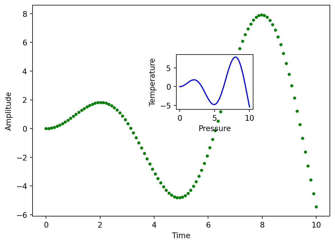
Using a sequential loop, multiple plots can be aligned and plotted together !
fig = plt.figure(figsize=(7, 7))

fig.subplots_adjust(hspace=0.4, wspace=0.4)

color = iter(plt.cm.rainbow(np.linspace(0, 1, 4))) # To customize the colors

xlabels = ['$a^{2} p$', 'a^{2} p', 'a^{2} p', 'a^{2} p']
ylabels = ['$y(x)$', '$y(x)$', '$y(x)$', '$y(x)$']

for i in range(1, 5):

    ax = fig.add_subplot(2, 2, i)
    c = next(color)

    ax.plot(x_m, y_m, c=c)

    ax.text(0, 5, '$a(t)=t \sin(t)$', fontsize=12);
    ax.set_xlabel(xlabels[i-1])
    ax.set_ylabel(ylabels[i-1])

plt.savefig('my_fig.pdf', dpi=120) # PDF format of the figure is saved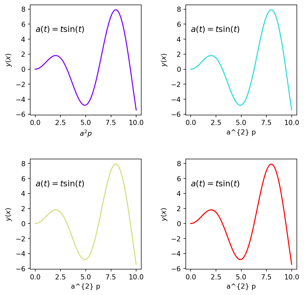
7.2.7 Visualizing a 3D function
Let us first define a function that takes in two co-ordinates and gives the height data !
%matplotlib inline
import matplotlib.pyplot as plt
import numpy as np
\[ z = sin(x)^{10} + cos(y)cos(x) \]
def f(x, y):
    return np.sin(x) ** 10 + np.cos(y) * np.cos(x)
x = np.linspace(0, 5, 100)
y = np.linspace(0, 5, 100)
X, Y = np.meshgrid(x, y)Xarray([[0. , 0.05050505, 0.1010101 , ..., 4.8989899 , 4.94949495,
5. ],
[0. , 0.05050505, 0.1010101 , ..., 4.8989899 , 4.94949495,
5. ],
[0. , 0.05050505, 0.1010101 , ..., 4.8989899 , 4.94949495,
5. ],
...,
[0. , 0.05050505, 0.1010101 , ..., 4.8989899 , 4.94949495,
5. ],
[0. , 0.05050505, 0.1010101 , ..., 4.8989899 , 4.94949495,
5. ],
[0. , 0.05050505, 0.1010101 , ..., 4.8989899 , 4.94949495,
5. ]])Z = f(X, Y)
Zarray([[1. , 0.99872489, 0.99490282, ..., 1.02487674, 0.98783019,
0.94108251],
[0.99872489, 0.99745141, 0.99363421, ..., 1.02464018, 0.98753068,
0.94072081],
[0.99490282, 0.99363421, 0.98983161, ..., 1.02393111, 0.98663291,
0.93963663],
...,
[0.1855199 , 0.18528334, 0.18457427, ..., 0.87377447, 0.79651651,
0.71004531],
[0.23489055, 0.23459104, 0.23369327, ..., 0.88293371, 0.80811321,
0.72404989],
[0.28366219, 0.28330049, 0.28221631, ..., 0.89198182, 0.81956921,
0.73788456]])Contour plots can be made using the height data.
fig, ax = plt.subplots(figsize=(7, 7))
ax.contour(X, Y, Z, colors='blue')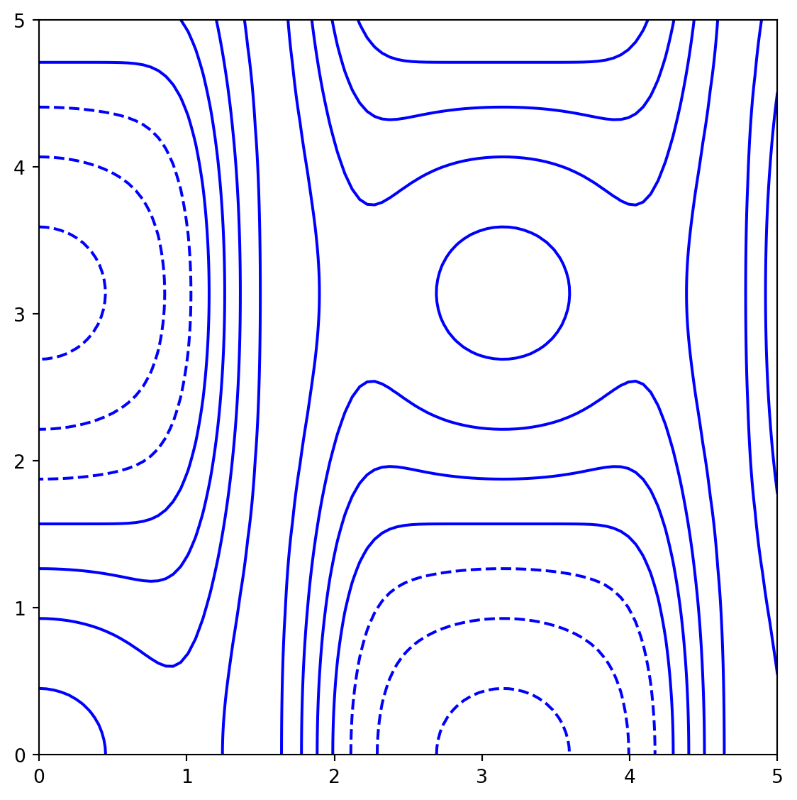
When a single color is used, negative values are represented by dashed lines, and positive values by solid lines. Futher options for colormaps can be found here: https://matplotlib.org/stable/tutorials/colors/colormaps.html
In case we want more lines (levels) to be drawn we can specify this in the command !
ax.contour(X, Y, Z, levels=30, cmap='Spectral')Also imshow can be used as it directly plots array data.
ax.imshow()does not need the grid data as the matrix position is implicit in the height grid. The x and y coordinates have to be explicitly specified using extent [xmin, xmax, ymin, ymax] of the image on the plot.ax.imshow()by default plots with the origin in the upper left ! Use the
Zarray([[1. , 0.99872489, 0.99490282, ..., 1.02487674, 0.98783019,
0.94108251],
[0.99872489, 0.99745141, 0.99363421, ..., 1.02464018, 0.98753068,
0.94072081],
[0.99490282, 0.99363421, 0.98983161, ..., 1.02393111, 0.98663291,
0.93963663],
...,
[0.1855199 , 0.18528334, 0.18457427, ..., 0.87377447, 0.79651651,
0.71004531],
[0.23489055, 0.23459104, 0.23369327, ..., 0.88293371, 0.80811321,
0.72404989],
[0.28366219, 0.28330049, 0.28221631, ..., 0.89198182, 0.81956921,
0.73788456]])img = ax.imshow(Z, cmap='Spectral', origin='lower')
fig.colorbar(img, ax=ax)Contour labels can be included using clabel !
import numpy as np
import matplotlib.pyplot as plt


# Create a figure and axes using the object-oriented approach
fig, ax = plt.subplots(figsize=(7, 7))

# Create the contour plot
contours = ax.contour(X, Y, Z, 5, colors='black')
ax.clabel(contours, inline=True, fontsize=12)

# Display the image
img = ax.imshow(Z, extent=[0, 5, 0, 5], origin='lower', cmap='Spectral', alpha=0.8)

# Add a colorbar
fig.colorbar(img, ax=ax)

# Show the plot
plt.show()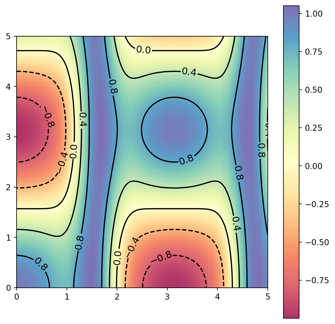
7.3 Visualizing Statistics
In 1774, Laplace’s first law posited that the frequency of errors can be described by an exponential function of the absolute value of the error, giving rise to the Laplace distribution. This distribution often models data in economics and health sciences more effectively than the traditional Gaussian distribution. The Laplace distribution is characterized by two parameters: the location parameter \(\mu\) (mean) and the scale parameter \(b\) (standard deviation).
\[f(x\mid\mu,b) = \frac{1}{2b} \exp \left( -\frac{|x-\mu|}{b} \right)\]
Let us generate two sets samples from the Laplace distribution !
import numpy as np
mu, b = 10, 1

data_1 = np.random.laplace(mu, b, 10000)
data_2 = np.random.laplace(mu*2, b, 10000)
plt.plot(data_2)
plt.show()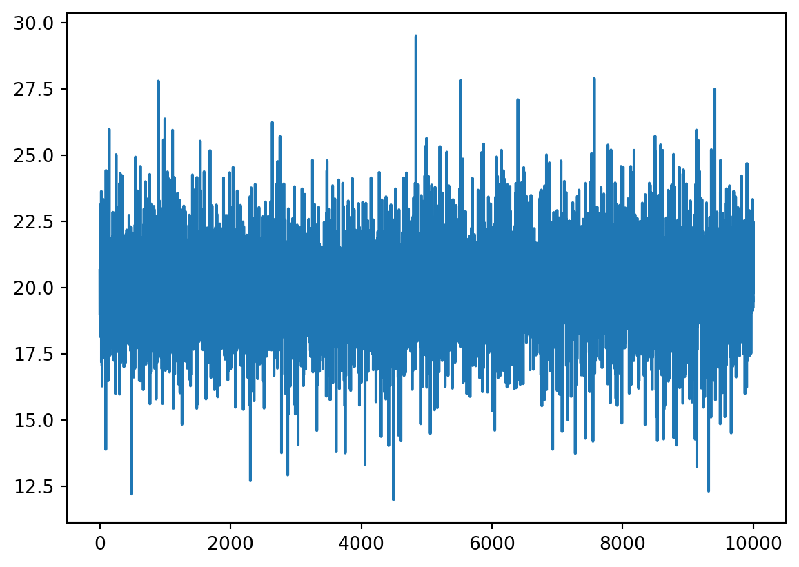
The histogram i.e. the frequency of the data in a certain bin can be visualized using the following command !
count, bins, ignored = plt.hist(data_1, bins=50, histtype='stepfilled', alpha=0.5, edgecolor='black')
count, bins, ignored = plt.hist(data_2, bins=50, histtype='stepfilled', alpha=0.5, edgecolor='red')
plt.xlabel('Time')
plt.ylabel('counts')
Text(0, 0.5, 'counts')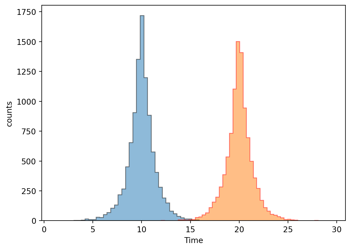
binsarray([11.99227956, 12.34213864, 12.69199772, 13.04185681, 13.39171589,
13.74157497, 14.09143405, 14.44129314, 14.79115222, 15.1410113 ,
15.49087038, 15.84072946, 16.19058855, 16.54044763, 16.89030671,
17.24016579, 17.59002488, 17.93988396, 18.28974304, 18.63960212,
18.9894612 , 19.33932029, 19.68917937, 20.03903845, 20.38889753,
20.73875662, 21.0886157 , 21.43847478, 21.78833386, 22.13819294,
22.48805203, 22.83791111, 23.18777019, 23.53762927, 23.88748836,
24.23734744, 24.58720652, 24.9370656 , 25.28692468, 25.63678377,
25.98664285, 26.33650193, 26.68636101, 27.0362201 , 27.38607918,
27.73593826, 28.08579734, 28.43565643, 28.78551551, 29.13537459,
29.48523367])7.4 Two-Dimensional Histograms
The multivariate normal, multinormal or Gaussian distribution is a generalization of the one-dimensional normal distribution to higher dimensions. Such a distribution is specified by its mean and covariance matrix. These parameters are analogous to the mean (average or “center”) and variance (standard deviation, or “width,” squared) of the one-dimensional normal distribution.
Covariance indicates the level to which two variables vary together.
mean = [0, 0]
covariance = [[1, 0], [0, 1]]
x, y = np.random.multivariate_normal(mean, covariance, 10000).T

plt.hexbin(x, y, gridsize=50, cmap='BuPu')

cb = plt.colorbar()
cb.set_label('counts in bin')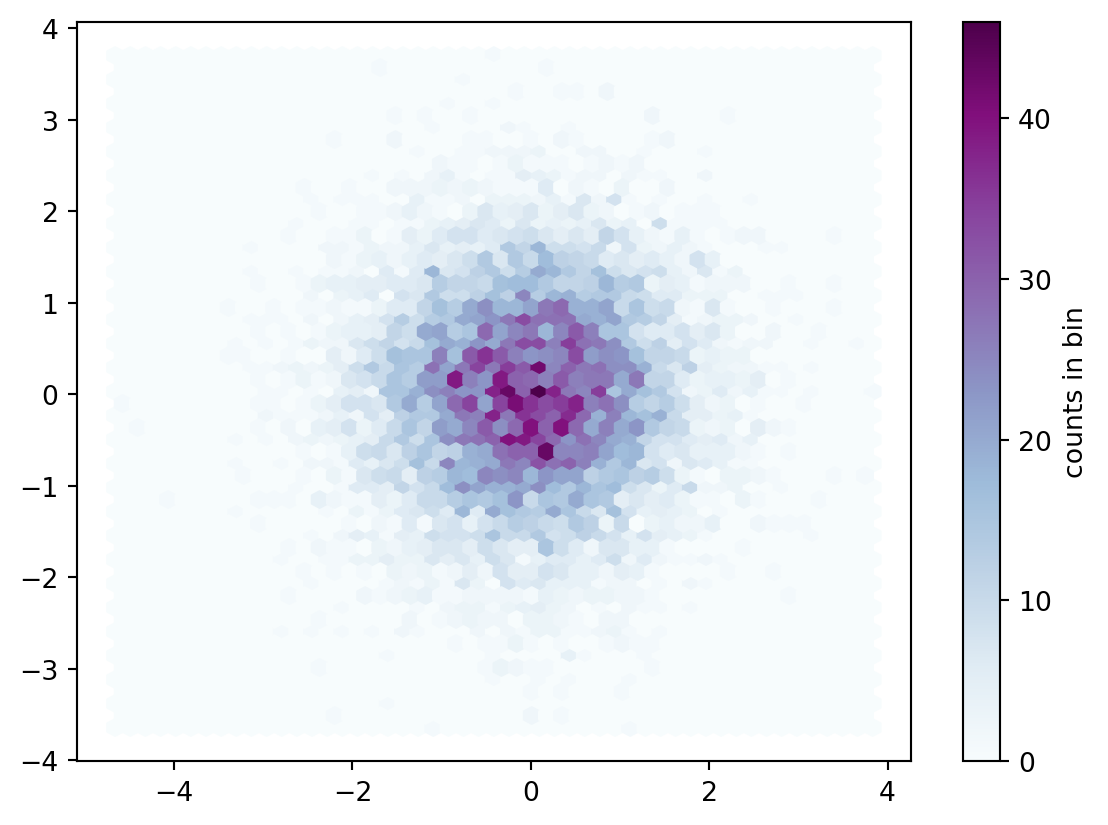
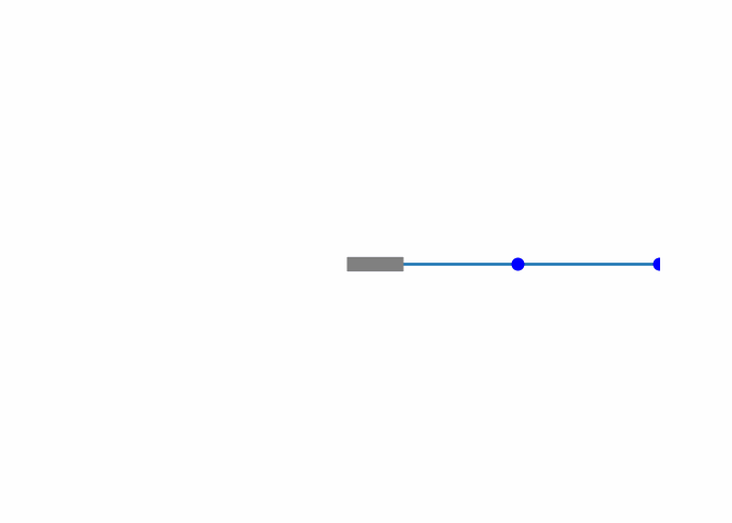
7.5 Animations: Chaotic Dynamics of a Double Pendulum
The double pendulum is a simple physical system that exhibits chaotic behavior. The double pendulum consists of two pendulums connected by a hinge. The motion of the double pendulum is governed by a set of coupled differential equations that are highly sensitive to initial conditions. This sensitivity to initial conditions is what leads to chaotic behavior. Below is the code to simulate the dynamics of a double pendulum using Python. The animation shows the chaotic motion of the double penduluum and has been computed using the Runge-Kutta and saved as a GIF using the Pillow library.
The governing equations for the double pendulum are given as:
\[ \mathbf{A}\left(\begin{array}{c} \dot{\theta}_{1}\\ \dot{\theta}_{2} \end{array}\right)+\mathbf{B}\left(\begin{array}{c} \ddot{\theta}_{1}\\ \ddot{\theta}_{2} \end{array}\right)-\mathbf{r}=0 \]
Where, \[ \mathbf{A}=\left[\begin{array}{cc} -m_{2}l_{1}l_{2}\dot{\theta}_{2}sin\left(\theta_{1}-\theta_{2}\right) & m_{2}l_{1}l_{2}\dot{\theta}_{2}sin\left(\theta_{1}-\theta_{2}\right)\\ -m_{2}l_{1}l_{2}\dot{\theta}_{1}sin\left(\theta_{1}-\theta_{2}\right) & m_{2}l_{1}l_{2}\dot{\theta}_{1}sin\left(\theta_{1}-\theta_{2}\right) \end{array}\right]\label{eq:16} \]
and
\[ \mathbf{B}=\left[\begin{array}{cc} \left(m_{1}+m_{2}\right)l_{1}^{2} & m_{2}l_{1}l_{2}cos\left(\theta_{1}-\theta_{2}\right)\\ m_{2}l_{1}l_{2}cos\left(\theta_{1}-\theta_{2}\right) & m_{2}l_{2}^{2} \end{array}\right]\label{eq:17} \]
with
\[ \mathbf{r}=\left[\begin{array}{c} -l_{1}g\left(m_{1}+m_{2}\right)sin\theta_{1}-m_{2}l_{1}l_{2}\dot{\theta}_{1}\dot{\theta}_{2}sin\left(\theta_{1}-\theta_{2}\right)\\ m_{2}l_{1}l_{2}\dot{\theta}_{1}\dot{\theta}_{2}sin\left(\theta_{1}-\theta_{2}\right)-l_{2}m_{2}g\,sin\theta_{2} \end{array}\right]\label{eq:18} \]
Assuming \(\frac{d\theta_1}{dt} = z_1\) and \(\frac{d\theta_2}{dt}= z_2\) we can implement the Runge-Kutta method to solve the ODEs.
Show the code
import numpy as np
import matplotlib.pyplot as plt
import matplotlib.animation as animation

# Parameters
g = 9.81  # acceleration due to gravity
L1 = 1.0  # length of the first pendulum
L2 = 1.0  # length of the second pendulum
m1 = 1.0  # mass of the first pendulum
m2 = 1.0  # mass of the second pendulum

def derivatives(state, t):
    theta1, z1, theta2, z2 = state
    delta = theta2 - theta1

    denominator1 = (m1 + m2) * L1 - m2 * L1 * np.cos(delta) ** 2
    denominator2 = (L2 / L1) * denominator1

    dydx = np.zeros_like(state)
    dydx[0] = z1
    dydx[1] = (m2 * L1 * z1 ** 2 * np.sin(delta) * np.cos(delta) +
               m2 * g * np.sin(theta2) * np.cos(delta) +
               m2 * L2 * z2 ** 2 * np.sin(delta) -
               (m1 + m2) * g * np.sin(theta1)) / denominator1
    dydx[2] = z2
    dydx[3] = (-m2 * L2 * z2 ** 2 * np.sin(delta) * np.cos(delta) +
               (m1 + m2) * g * np.sin(theta1) * np.cos(delta) -
               (m1 + m2) * L1 * z1 ** 2 * np.sin(delta) -
               (m1 + m2) * g * np.sin(theta2)) / denominator2
    return dydx

def runge_kutta_step(func, y, t, dt):
    k1 = dt * func(y, t)
    k2 = dt * func(y + 0.5 * k1, t + 0.5 * dt)
    k3 = dt * func(y + 0.5 * k2, t + 0.5 * dt)
    k4 = dt * func(y + k3, t + dt)
    return y + (k1 + 2 * k2 + 2 * k3 + k4) / 6

# Initial conditions
theta1 = np.pi / 2
theta2 = np.pi / 2
z1 = 0.0
z2 = 0.0
state = np.array([theta1, z1, theta2, z2])

# Time parameters
t = 0.0
dt = 0.01
t_final = 10.0
time = np.arange(t, t_final, dt)

# Solve the ODE
states = np.zeros((len(time), 4))
for i, t in enumerate(time):
    states[i] = state
    state = runge_kutta_step(derivatives, state, t, dt)

# Extract the angles
theta1 = states[:, 0]
theta2 = states[:, 2]

# Calculate positions
x1 = L1 * np.sin(theta1)
y1 = -L1 * np.cos(theta1)
x2 = x1 + L2 * np.sin(theta2)
y2 = y1 - L2 * np.cos(theta2)
This guide explains how to create animations in Python using Matplotlib, specifically focusing on generating a GIF file. The provided code demonstrates the necessary steps to set up and animate a plot.
- Import Necessary Libraries First, ensure you have the necessary libraries installed:
import matplotlib.pyplot as plt
import matplotlib.animation as animation- Set Up the Figure and Axis Create a figure and axis, and configure the limits and appearance:
fig, ax = plt.subplots()
ax.set_xlim(-2, 2)
ax.set_ylim(-2, 2)
line, = ax.plot([], [], lw=2)  # Line plot
marker1, = ax.plot([], [], 'bo', markersize=8)  # First marker
marker2, = ax.plot([], [], 'bo', markersize=8)  # Second marker
ax.hlines(y=0.0, xmin=-0.2, xmax=0.2, linewidth=10, color='gray')  # Horizontal line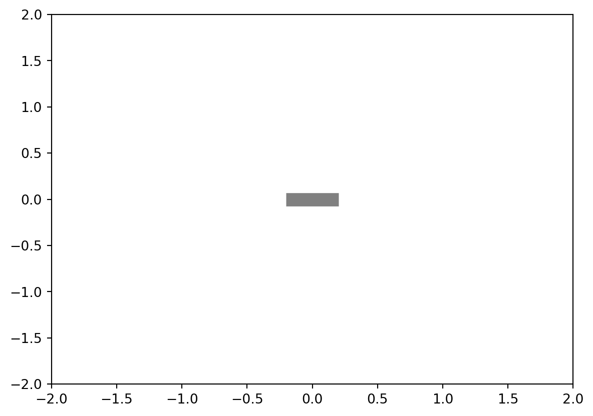
Hide the axis spines and disable the axis:
for spine in ['top', 'right', 'left', 'bottom']:
    ax.spines[spine].set_visible(False)
ax.set_axis_off()- Define the Initialization Function The
initfunction initializes the plot components:
def init():
    line.set_data([], [])
    marker1.set_data([], [])
    marker2.set_data([], [])
return line, marker1, marker2- Define the Update Function The
updatefunction updates the plot for each frame. It sets the data for the line and markers based on the current frame:
def update(frame):
    line.set_data([0, x1[frame], x2[frame]], [0, y1[frame], y2[frame]])
    marker1.set_data([x1[frame]], [y1[frame]])
    marker2.set_data([x2[frame]], [y2[frame]])
return line, marker1, marker2- Create the Animation Use
FuncAnimationto create the animation. Specify the figure, update function, number of frames, and initialization function:
ani = animation.FuncAnimation(fig, update, frames=len(time),
init_func=init, blit=True)- Save the Animation as a GIF Finally, save the animation using Pillow:
ani.save('data/double_pendulum.gif', writer='pillow', fps=30)- Close the Plot Close the plot to avoid displaying it:
plt.close()7.6 Exercises
7.6.1 Theory
- What is Matplotlib, and how is it used in Python?
- What are some of the different types of plots that can be created using Matplotlib?
- How can the appearance of a plot be customized in Matplotlib?
- How does Matplotlib integrate with other Python libraries such as NumPy and Pandas?
- How can Matplotlib be used to create interactive plots and visualizations?
7.6.2 Coding
- Create a simple line plot using Matplotlib, where the x-axis represents time and the y-axis represents some quantity (such as temperature, stock prices, etc.). Customize the appearance of the plot, including the title, axis labels, and color.
- Create a bar chart using Matplotlib to compare the performance of different models in a machine learning task. Customize the appearance of the chart to make it more visually appealing and informative.
- Create a pie chart using Matplotlib to visualize the distribution of a categorical variable in a dataset. Add labels to the chart to show the percentage of each category.
- Create a function and generate data using numpy. Plot this data using scatter plot.